Nuxt.js x Class API x Storybook (x SCSS)
前提・環境
$ node -v
v14.17.3

$ npm -v
7.19.1

$ yarn -v
1.22.10

$ nuxt -v
@nuxt/cli v2.15.8
- Nuxt.js x TypeScript x Class API のプロジェクトが用意されていること
Class API の Nuxt.js で Storybook を使ってみる
まずはデフォルトで動作確認
1. まずは https://storybook.js.org/docs/react/get-started/install に従って Storybook をインストール
$ npx sb init
2. デフォルト状態で動作確認
$ yarn storybook
3. 問題ないことを確認
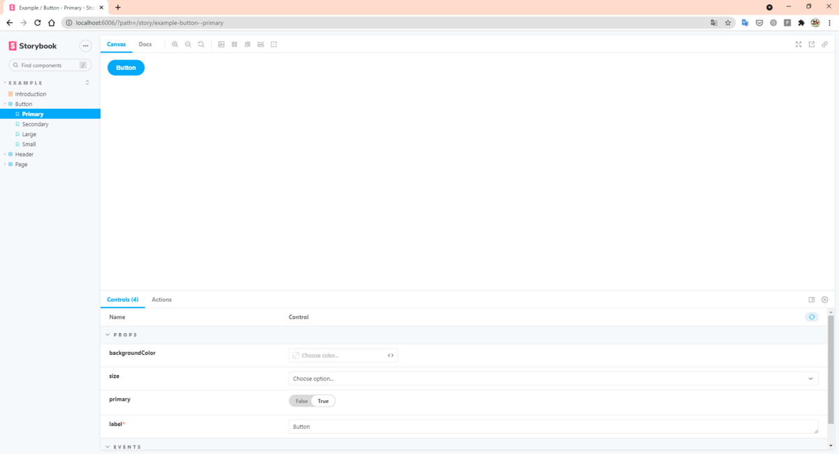
まぁ。。。Options API の例だし、できるよね。
続いて、↑ で生成された Vue ファイルを Class API 向けに編集する
1. 編集作業
// ./stories/Button.vue

  <template>
    <button type="button" :class="classes" @click="onClick" :style="style">{{ label }}</button>
  </template>

- <script>
- import './button.css';
+ <script lang="ts">
+ import { Vue, Component, Prop } from 'vue-property-decorator'

- export default {
-   name: 'my-button',
+ @Component
+ export default class Input extends Vue {

-   props: {
-     label: {
-       type: String,
-       required: true,
-     },
-     primary: {
-       type: Boolean,
-       default: false,
-     },
-     size: {
-       type: String,
-       default: 'medium',
-       validator: function (value) {
-         return ['small', 'medium', 'large'].indexOf(value) !== -1;
-       },
-     },
-     backgroundColor: {
-       type: String,
-     },
-   },
+   @Prop({ type: String, required: true })
+   private readonly label!: string
+   @Prop({ type: Boolean, default: false })
+   private readonly primary!: boolean
+   @Prop({
+     type: String,
+     default: 'medium',
+     validator: (value) => {
+       return ['small', 'medium', 'large'].indexOf(value) !== -1
+     },
+   })
+   private readonly size!: string
+   @Prop({ type: String })
+   private readonly backgroundColor!: string

-   computed: {
-     classes() {
-       return {
-         'storybook-button': true,
-         'storybook-button--primary': this.primary,
-         'storybook-button--secondary': !this.primary,
-         [`storybook-button--${this.size}`]: true,
-       };
-     },
-     style() {
-       return {
-         backgroundColor: this.backgroundColor,
-       };
-     },
-   },
+   private get classes() {
+     return {
+       'storybook-button': true,
+       'storybook-button--primary': this.primary,
+       'storybook-button--secondary': !this.primary,
+       [`storybook-button--${this.size}`]: true,
+     }
+   }
+   private get style() {
+     return {
+       backgroundColor: this.backgroundColor,
+     }
+   }

-   methods: {
-     onClick() {
-       this.$emit('onClick');
-     },
-   },
+   private onClick() {
+     this.$emit('onClick')
+   }
- };
+ }
    </script>

+ <style scoped>
+ .storybook-button {
+   font-family: 'Nunito Sans', 'Helvetica Neue', Helvetica, Arial, sans-serif;
+   font-weight: 700;
+   border: 0;
+   border-radius: 3em;
+   cursor: pointer;
+   display: inline-block;
+   line-height: 1;
+ }
+ .storybook-button--primary {
+   color: white;
+   background-color: #1ea7fd;
+ }
+ .storybook-button--secondary {
+   color: #333;
+   background-color: transparent;
+   box-shadow: rgba(0, 0, 0, 0.15) 0px 0px 0px 1px inset;
+ }
+ .storybook-button--small {
+   font-size: 12px;
+   padding: 10px 16px;
+ }
+ .storybook-button--medium {
+   font-size: 14px;
+   padding: 11px 20px;
+ }
+ .storybook-button--large {
+   font-size: 16px;
+   padding: 12px 24px;
+ }
+ </style>
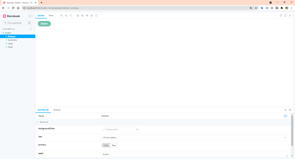
2. そして動作確認!
$ yarn storybook
問題なく行ける!!
この調子で SCSS もやってしまえ!
Style を SCSS にする
1. 編集作業
// ./stories/Button.vue

- <style scoped>
+ <style lang="scss" scoped>
2. 動作確認
$ yarn storybook
ERROR in ./stories/Button.vue?vue&type=style&index=0&id=43fc969c&lang=scss&scoped=true& (./node_modules/vue-docgen-loader/lib??ref--12!./node_modules/vue-loader/lib??vue-loader-options!./stories/Button.vue?vue&type=style&index=0&id=43fc969c&lang=scss&scoped=true&) 49:0
Module parse failed: Unexpected token (49:0)
File was processed with these loaders:
* ./node_modules/vue-docgen-loader/lib/index.js
* ./node_modules/vue-docgen-loader/lib/index.js
* ./node_modules/vue-loader/lib/index.js
You may need an additional loader to handle the result of these loaders.
- ここに来て、エラー!
3. ということでググる
- https://storybook.js.org/docs/react/configure/webpack#extending-storybooks-webpack-config
- どうやら、SCSS を使うときは Webpack Config をいじってね。とのことらしい。
ということでいじる
// ./.storybook/main.jsmain.js

+ const path = require('path');

module.exports = {
    "stories": [
    "../stories/**/*.stories.mdx",
    "../stories/**/*.stories.@(js|jsx|ts|tsx)"
    ],
    "addons": [
    "@storybook/addon-links",
    "@storybook/addon-essentials"
-   ]
+   ],
+   webpackFinal: async (config, { configType }) => {
+     // `configType` has a value of 'DEVELOPMENT' or 'PRODUCTION'
+     // You can change the configuration based on that.
+     // 'PRODUCTION' is used when building the static version of storybook.
+
+     // Make whatever fine-grained changes you need
+     config.module.rules.push({
+       test: /\.scss$/,
+       use: ['style-loader', 'css-loader', 'sass-loader'],
+       include: path.resolve(__dirname, '../'),
+     });
+
+     // Return the altered config
+     return config;
+   },
}
4. 動作確認
$ yarn storybook
いけた!
assets/scss/styles.scss に定義してある変数を使ってみる
1. Vue ファイルの編集作業
// ./stories/Button.vue

  .storybook-button--primary {
-   color: white;
-   background-color: #1ea7fd;
+   color: $color_light;
+   background-color: $color_primary;
  }
2. 動作確認
$ yarn storybook
ERROR in ./stories/Button.vue?vue&type=style&index=0&id=43fc969c&lang=scss&scoped=true& (./node_modules/css-loader/dist/cjs.js!./node_modules/vue-loader/lib/loaders/stylePostLoader.js!./node_modules/sass-loader/dist/cjs.js!./node_modules/vue-loader/lib??vue-loader-options!./stories/Button.vue?vue&type=style&index=0&id=43fc969c&lang=scss&scoped=true&)
Module build failed (from ./node_modules/sass-loader/dist/cjs.js):
SassError: Undefined variable.
╷
59 │   color: $color_light;
│          ^^^^^^^^^^^^
3. Storybook の設定周り編集作業
// ./.storybook/main.js

    config.module.rules.push({
    test: /\.scss$/,
-   use: ['style-loader', 'css-loader', 'sass-loader'],
+   use: [
+     'style-loader',
+     'css-loader',
+     'sass-loader',
+     {
+       loader: 'sass-resources-loader',
+       options: {
+         resources: ['assets/scss/styles.scss'],
+       },
+     },
+   ],
    include: path.resolve(__dirname, '../'),
    })
4. 動作確認
$ yarn storybook
最後に
- Storybook をインストールしたことで、
yarn dev実行時に CSS-Loader 周りにエラーが出る yarn add -D css-loader@4.2.0とバージョン指定することで解決できる
yarn dev と yarn storybook 別々のビルドになるので、両方確認しなきゃいけないことがわかった。